Crazy House Drawings, II
Dear Readers,
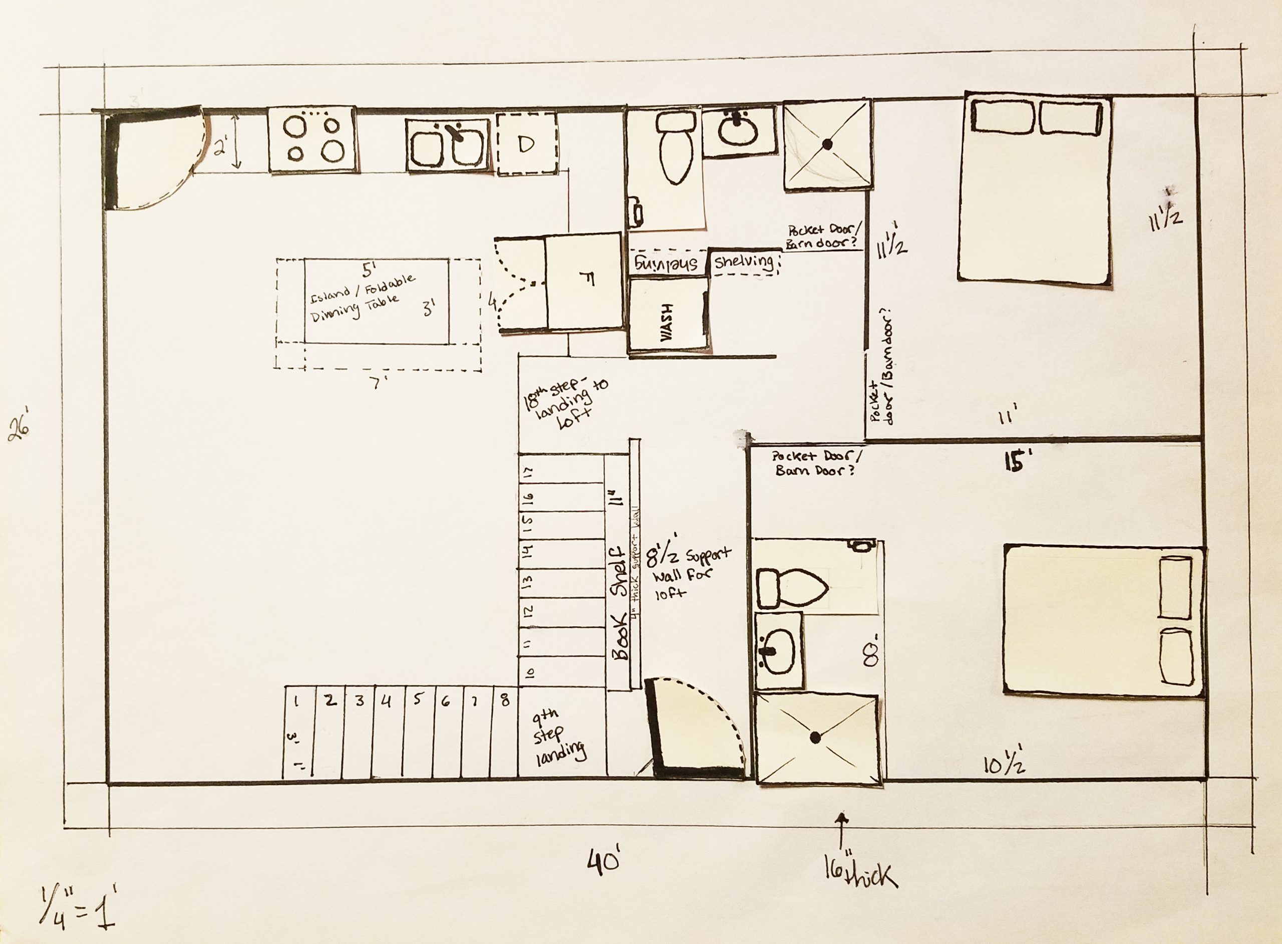
Just in case William and I’s children are a total disgrace to the family name and are not able to levitate, I remembered the stairs in this second rendition of our floor plans. As you’ll notice, we also added four feet to the length of our home, now bringing our home to be 26’ x 40’ (previously, it was 26’ x 36’). William wanted the home to be just a tad longer so that he could attempt to incorporate the ‘golden ratio’ into the design of our home. I will go over what exactly the golden ratio is in a lil’ bit…
We also made it slightly longer because we wanted to include a bathroom into the master bedroom. When I have to pee, I have to pee…and we realized that one bathroom and an unknown number of children would be an unnecessary hardship I just don’t feel like dealing with.
As you can see in the below image, we rearranged the stacked washer and dryer to go in a nifty nook near the ‘public’ bathroom, rather than being placed at the end of a long, dark, sketchy hallway. After a consultation with my aunt, she gave us the very true, and very helpful advice, that hallways are really a waste of space. Especially long, dark, sketchy hallways which only have a washer and dryer waiting for you at the end. It sounded just too much like a Goosebumps book waiting to happen.
Floor plan with our fun paper cut-out necessities.
Also, yes. William did indeed take the time to make semi-drawn-to-scale beds, toilets, sinks, showers, etc. so that we could play pretend on all of our different floor plans.
Oh! And the bookshelf!! Did you see the bookshelf?? This bookshelf will be about 10 feet high and 8 feet wide. The stairs will go up and along them to the loft, allowing us to have access to the higher placed books and trinkets.
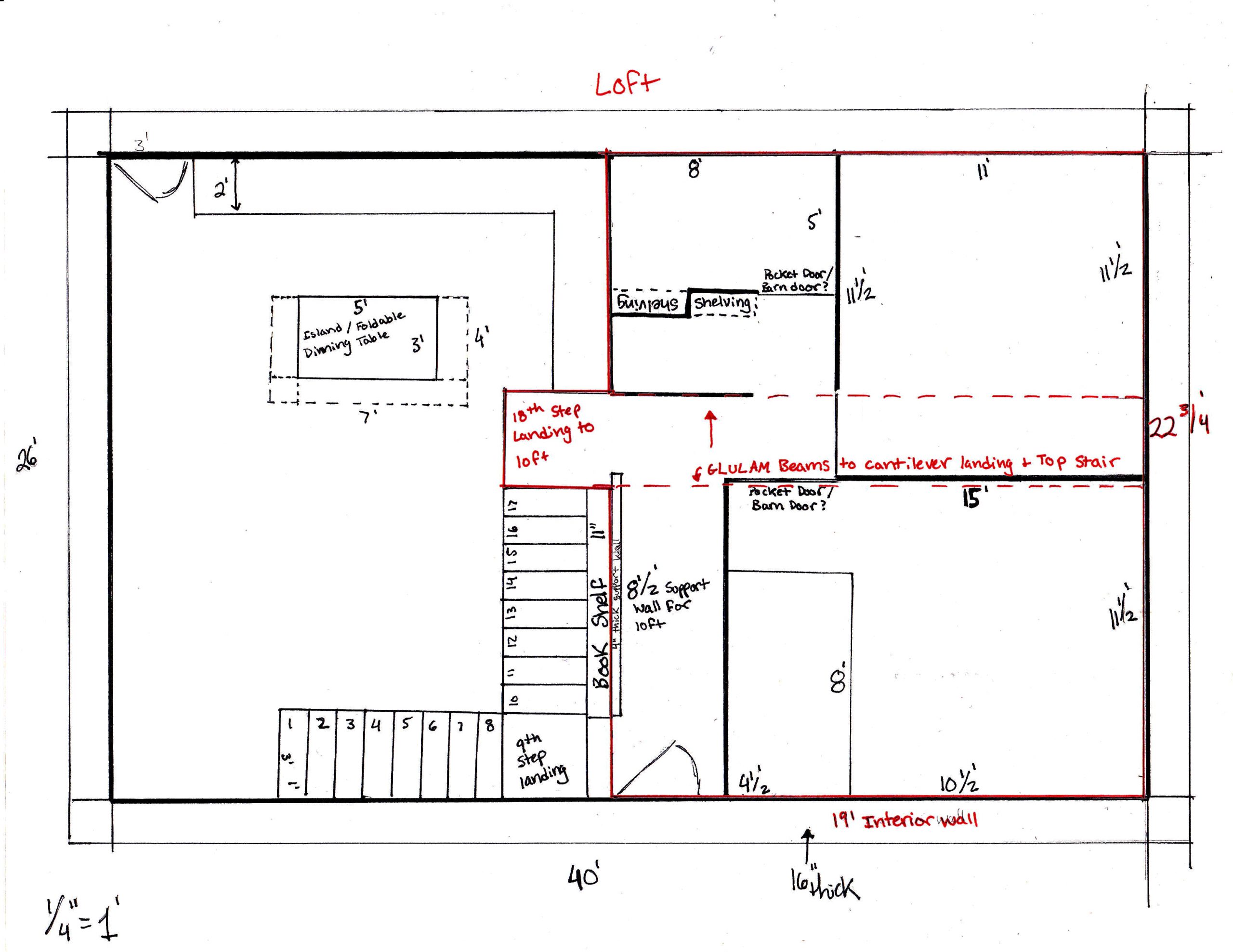
The loft itself will be roughly 19’ by 23-ish’. The 18th step and landing to the loft will be cantilevered and supported by two glulam beams. The loft portion specifically can be seen in red in the drawing below.
Floor plan with loft shown above in red.
Ignore the crooked dashed lines where the glulam beams will be…they will hopefully be built straight in our real house.
Besides the crooked glulam beams, other things to most definitely work on in future floor plan renditions:
1. We want this home to be ADA accessible. The Seed is being built with the intention for it to not only be generational, but also adaptable. When our parents move in with us 20+ years down the road, we need it to be able to accommodate them. When William and I reach a point in age when we can’t walk on our own, our home needs to be able to accommodate us. When friends and loved ones visit us who have physical limitations, they should not have to feel the weight of those physical limitations in our home. They should feel capable. Welcomed. Encouraged. If life brings about a child of ours who is unable to walk, or William or I are handicapped in the future…The Seed should enable the inhabitants it harbors to not only feel physically enabled, but to be physically able.
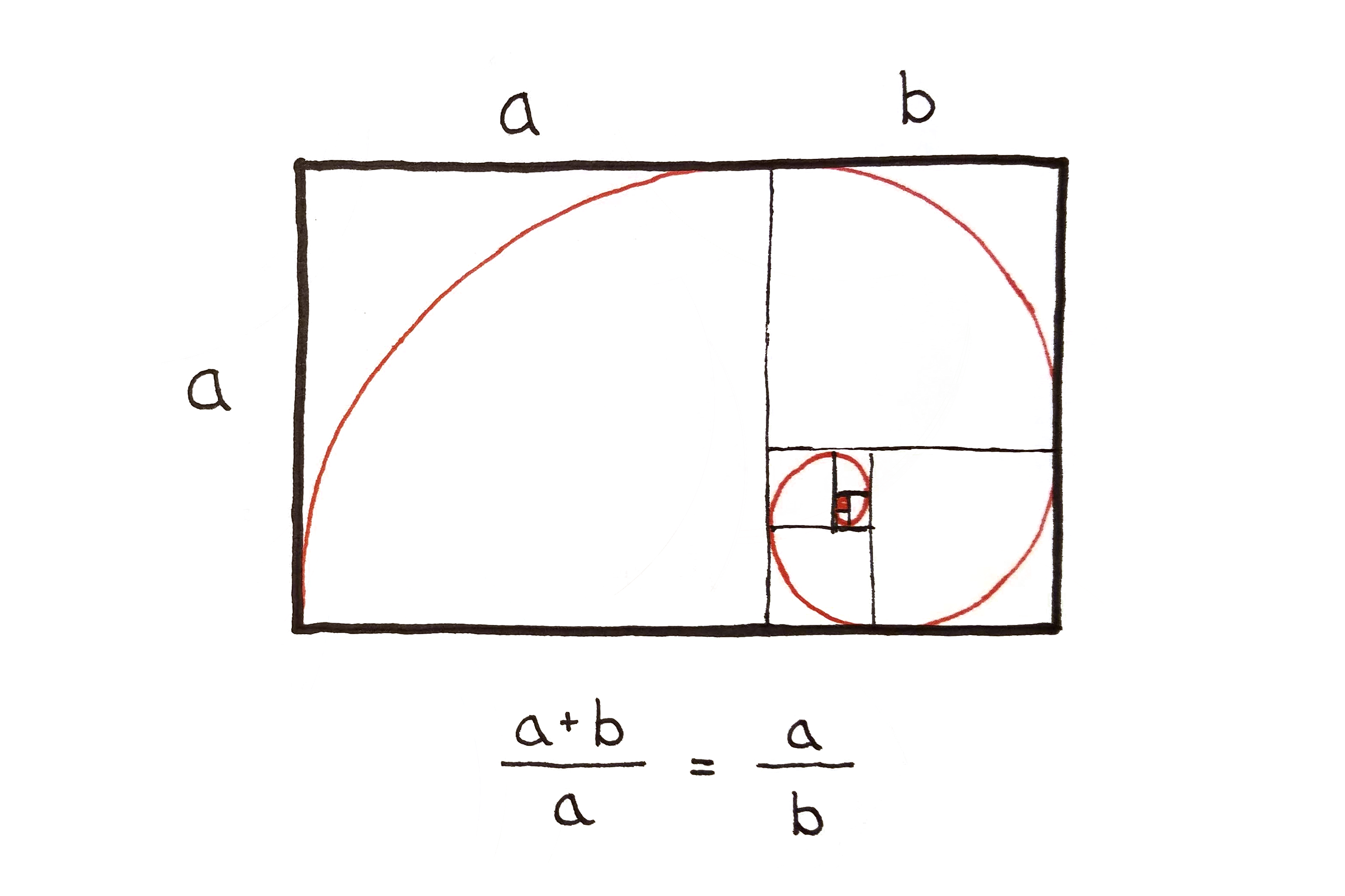
2. Confirm that the golden ratio is integrated into our home’s floor plan as close as possible. Ha! And, just literally now, as I am prepping this blog to be published…William informed me that our home has to be about two feet longer in order to actually mirror the golden ratio. So! Hopefully you shall see that change in “Crazy House Drawings, III.” For those who are unfamiliar with the golden ratio, it is the spiral. The spiral is a design element that recurs in nature…in lots o’ things. Think conch shells…snail shells…unfurling ferns…the center of sunflowers…ocean waves…the milky way…hurricanes seen from outer space…your face. This spiral occurs in nature naturally, and it is peaceful and nice to look at. Because the spiral strikes some sort of inner cord within our humanity to connect with that which is naturally beautiful…math people, architecture people, artsy people…all kinds of people…have developed a way to mathematically define it in a ratio. This ratio, when incorporated into the architectural design of buildings and homes, can be considered a form of ‘biophilic design’~ bringing the natural into our living spaces. If we realllyyyy wanted to get down with the golden ratio, we could put ferns, conch shells, sun flowers, and yes, faces, all throughout our golden ratio designed home as well. So. Much. Biophilia.

THE Spiral..the Golden Ratio.
3. The prefab transportation aspect of this second rendition of our floor plan. We still want The Seed to be built with prefabrication in mind. Which means we need to think how a home like ours will be transported down both highways and backroads. We obviously will still need this design to come in two separate segments (because road regulations are a thing), and then the two modules could be conected on-site. We would like to use our house origami to achieve this (where the segments of roof actually wrap around and protect the module in transit, and then unfold on-site, connect to one another, and BAM! House.) Just something to think about.
Stay tuned as all of the craziness and ideas continue to develop!!
Sincerely,
Shelby Aldrich
4 Comments
Submit a Comment
© 2020 Sustaining Tree
© 2020 Sustaining Tree


I love your floor plan. Two bathrooms is better.
We love you and miss you both,
Aunt Jeni &Uncle Russ
Thank you, Aunt Jeni!! Yes, I think adding a second bathroom will definitely prove to be a good idea! An extra composting toilet also means extra fertilizer! 😉 We love and miss you both as well <3 <3 <3
So, if you are not sure of how many kids, is the loft for the ones that won’t fit in the 2nd bedroom? By the way Shelby, you are so comical with some of this, I love it and you!
Ha! Basically, yes! The loft is extra storage for our kids 🙂 Thank you, Aunt Rose, for reading!! We love you too 🙂 <3